


We use the nonhyperbolic moveout inversion of
Alkhalifah (1997) to estimate interval ![]() for the seismic line from Trinidad.
The result of this inversion is an interval
for the seismic line from Trinidad.
The result of this inversion is an interval ![]() curve as a function of time.
This inversion, though based on a laterally homogeneous medium assumption, has
some tolerance to lateral inhomogeneity, such as the lateral inhomogeneity associated
with most faults.
curve as a function of time.
This inversion, though based on a laterally homogeneous medium assumption, has
some tolerance to lateral inhomogeneity, such as the lateral inhomogeneity associated
with most faults.
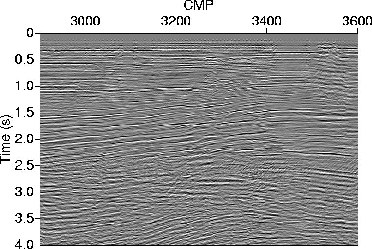 |

Figure 1 shows a zero-offset section that contains a large number of faults. Note that the data beyond 2.5 s are of poor quality.
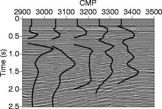
Figure 2 shows five ![]() curves superimposed on
a migrated section from this region. Specifically, the zero
curves superimposed on
a migrated section from this region. Specifically, the zero ![]() value at the top of each curve is placed at the position of the measurement corresponding
to that curve. The lateral
correlation, especially up shallow, between these
curves, which are nearly 1.25 km
apart, is notable. The difference between the curves at depth is a result
of the complexity of the medium at depth. We can attribute
some of these differences to the limitations
of this inversion at later times (Alkhalifah, 1997).
value at the top of each curve is placed at the position of the measurement corresponding
to that curve. The lateral
correlation, especially up shallow, between these
curves, which are nearly 1.25 km
apart, is notable. The difference between the curves at depth is a result
of the complexity of the medium at depth. We can attribute
some of these differences to the limitations
of this inversion at later times (Alkhalifah, 1997).
 |
A more laterally continuous representation is given by the 2-D plot of interval ![]() in Figure 3 (at the bottom), where measurements were taken
at practically every CMP location and subsequently used to estimate a more
continuous interval
in Figure 3 (at the bottom), where measurements were taken
at practically every CMP location and subsequently used to estimate a more
continuous interval ![]() distribution. Figure 3 (at the top)
shows the interval velocity extracted through the same process.
Most of the observations
obtained from Figure 2 apply to Figure 3
as well. Moreover, the correlation
between the layering and the
distribution. Figure 3 (at the top)
shows the interval velocity extracted through the same process.
Most of the observations
obtained from Figure 2 apply to Figure 3
as well. Moreover, the correlation
between the layering and the ![]() distribution is even more apparent in
Figure 3.
Faults
probably explain the sudden variations of
distribution is even more apparent in
Figure 3.
Faults
probably explain the sudden variations of ![]() at certain locations.
Overall, however,
at certain locations.
Overall, however, ![]() has good lateral continuity. Some faulting has disrupted this continuity,
and
these faults are indicated in gray. The lack of information beyond 2.0 s is a result of the
methods depth limitation and the poor data quality at depth.
has good lateral continuity. Some faulting has disrupted this continuity,
and
these faults are indicated in gray. The lack of information beyond 2.0 s is a result of the
methods depth limitation and the poor data quality at depth.
 |
Also, data at CMP locations 3450-3600 are of low quality, because of the presence
of shallow gas in the area. Some of
the effect of the shallow gas can be seen on the stacked section in Figure 1.
The estimates in Figure 3 are of low resolution both laterally and vertically, and
as a result no abrupt fault affects are apparent. Nevertheless, there is some vertical shift in the ![]() distribution between the sides of some of the large faults.
distribution between the sides of some of the large faults.
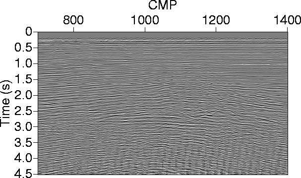 |
Figure 4 shows a zero-offset section that also contains
a large number of faults. Wells are located at CMP 1100 and 1220; both
above an anticline structure. Overall, this area has the same characteristics
as the area depicted in Figure 1 despite the large distance between
the two regions (![]() km).
km).
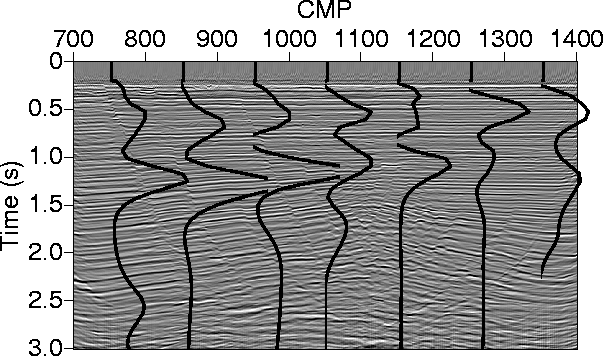 |
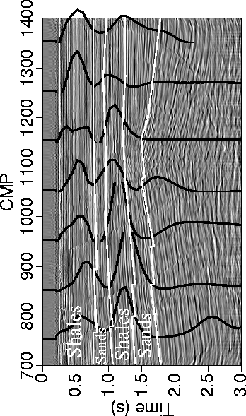
Figure 5 shows seven ![]() curves superimposed on
a migrated section from this region. These
curves superimposed on
a migrated section from this region. These ![]() curves
are placed in their respective
positions in Figure 5. The lateral
correlation between these
curves, which are about 1.25 km
apart, is also remarkable. Especially remarkable is the
correlation between the thickness of the shale layers and the size of
curves
are placed in their respective
positions in Figure 5. The lateral
correlation between these
curves, which are about 1.25 km
apart, is also remarkable. Especially remarkable is the
correlation between the thickness of the shale layers and the size of ![]() as we can see
by comparing the measurements
at CMP 750 with that at CMP 1050 for the top layer.
These
as we can see
by comparing the measurements
at CMP 750 with that at CMP 1050 for the top layer.
These ![]() values are plausible, especially compared with the large
values are plausible, especially compared with the large ![]() values
we obtained for our earlier paper. Part of the reason for this improvement is the
improved stability measures applied to the new estimates.
values
we obtained for our earlier paper. Part of the reason for this improvement is the
improved stability measures applied to the new estimates.
A more continuous estimation of ![]() is given by the 2-D plot of
is given by the 2-D plot of ![]() in Figure 6 (at the bottom), which resembles
Figure 3. Figure 6 (at the top) also
shows the interval velocity extracted through the same process.
Again, most of the observations
regarding Figure 5 apply here as well. However, more detail
is apparent in this continuous
in Figure 6 (at the bottom), which resembles
Figure 3. Figure 6 (at the top) also
shows the interval velocity extracted through the same process.
Again, most of the observations
regarding Figure 5 apply here as well. However, more detail
is apparent in this continuous ![]() representation. The three major faults in the area are drawn
to show their effect on the measurements. Again, the poor quality of data at later times
is the reason behind the lack of estimates at depth. Figure 7 shows a sample
CMP gather (CMP 1000) after NMO correction.
Probably, the last laterally-continues reflection appears just above the 2-second mark.
representation. The three major faults in the area are drawn
to show their effect on the measurements. Again, the poor quality of data at later times
is the reason behind the lack of estimates at depth. Figure 7 shows a sample
CMP gather (CMP 1000) after NMO correction.
Probably, the last laterally-continues reflection appears just above the 2-second mark.
 |
|
cmp1000
Figure 7 Common-midpoint gather (CMP) 1000 after NMO correction with the proper NMO velocity obtained from conventional velocity analysis. | 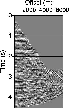 |
Figure 8 shows a crude lithologic interpretation
estimated solely from the anisotropic inversion. The interpretation is
based on the fact that shales are anisotropic, and therefore exhibit large
positive ![]() values,
while sands are essentially isotropic with near-zero
values of
values,
while sands are essentially isotropic with near-zero
values of ![]() . The second sand layer may also include a lot of shales because
the drop in
. The second sand layer may also include a lot of shales because
the drop in ![]() is not very definite. Also, at this depth the data quality is bad.
is not very definite. Also, at this depth the data quality is bad.
 |